Building Future-Ready Schools
At World Savvy, we collaborate with educators and school and district leaders to build future-ready learning environments that are inclusive, adaptive, and prepare students to thrive today and in the future. For decades, we've led the way in reimagining education, leveraging our network's learning and impact to support educators nationwide. We believe that global competence is critical to a quality education, and we're committed to integrating this into schools and districts nationwide. Join us in ensuring all students can thrive in our complex and interconnected future.

Mission
To educate and engage youth to learn, work, and thrive as responsible global citizens.

Vision
We envision a K-12 education system that prepares all students with the knowledge, skills, and dispositions for success and active engagement in the global community.

Our Origins

World Savvy is a 501(c)(3) nonprofit organization born from the vision of Dana Mortenson and Madiha Murshed in 2002. In the aftermath of the tragic 9/11 events, the two friends recognized an urgent need to address the lack of global competence among young people in the U.S. This realization was intensified by personal experiences as Madiha, a Bangladeshi Muslim woman, faced acts of xenophobia in New York City. The founders understood the roots of these issues resulted from a need for more exposure to diverse cultures, beliefs, and global issues.
Motivated by a shared belief in education as a great leveler and inspired by their family legacies in education, Dana and Madiha turned their passion and concern into action. They interrogated a simple yet powerful question: How were young people in the U.S. being prepared for a more globally interconnected and diverse world?

Since then, our organization has grown from serving one high school in Oakland, CA to reaching 904,000 students and 7,300 teachers across 45 U.S. states and 32 countries. At World Savvy, we work towards systemic change by creating the conditions for global competence to be deeply embedded into teaching, learning, culture, and policy.
We recognize that the current K-12 education system is an outdated model designed for the 20th century. Standardized learning and testing were sufficient for preparing young people for standardized jobs and homogeneous communities. However, this is no longer our reality, and thus it is no longer a viable educational option for our children. We are changing that by empowering education leaders and educators with the tools and resources necessary to embed global competence into their curriculums, fostering an environment of inclusive, adaptive, and future-ready learning.
We are committed to leveraging the learning and impact of our network towards broader policy change, recognizing global competence as critical to a quality education across the country. Only then can our educational systems truly prepare young people for future jobs, citizenship, learning, and problem-solving.

Our Story
Journey through our timeline to see the milestones, innovations, and moments that have shaped World Savvy into today's impactful organization.
Our Impact
Over the past two decades, we've made significant strides in achieving our vision of creating a K-12 education system that prepares all students for success and active engagement in their local and global community.
of educators increased their ability to implement clear classroom norms that center the Global Competence Matrix
of educators agree World Savvy coaches help them reflect on their work with students and the curriculum
of educators agree that World Savvy coaches support their growth as a globally competence educator
Our Comprehensive School Partnerships have created inclusive, adaptive, and future-ready learning environments by embedding global competence into teaching, learning, and school culture. Some highlights from our recent partnerships include:
83% of educators improved their capacity to personalize learning, centering students’ strengths, needs, and interests
88% of educators enhanced their ability to explore and nurture connections across identities
World Savvy was recently selected as one of the top 100 education innovations in the 2023 HundrED Global Collection out of 3,488 worldwide.
Learn MoreOur district partnerships support leaders to think about the systems and practices that can support global competence throughout a district through leadership cohorts, graduate profile development, and global competence readiness assessments.
Learn More about Our District Partnerships
Perhaps most important is the way in which World Savvy has supported our Cohort’s development of global competencies; as leaders, we are encouraged to do the deep work of sorting out where we are, where we would like to be, and how we can best get there.
- Camilla Modesitt, Denver Public Schools

Our Values
At World Savvy, we believe in doing good, well. These values, beliefs, norms, and behaviors are leaned into, practiced, and lifted up in all interactions with our school partners and within World Savvy.
Our Team
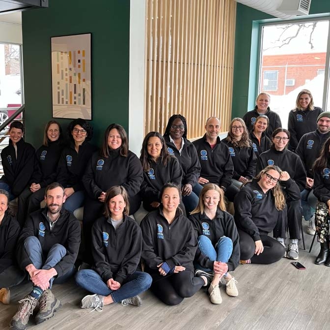
Our talented staff is the driving force behind our organization's success.
We’re passionate about education and believe in its power to prepare youth to meet some of our biggest challenges. Our diverse team brings expertise from backgrounds in education, international affairs, social work, journalism, arts, and more. Together, we collaborate towards empowering the next generation of leaders to thrive in an interconnected world.
Meet Our TeamWork With UsOur Donors and Partners
We could not be more grateful to those who invest in World Savvy's success in a multitude of ways, giving of their time, talent, and treasure to make this work possible. Learn more about our community of support, and the partnerships they make possible.
Read More


